Inspirations
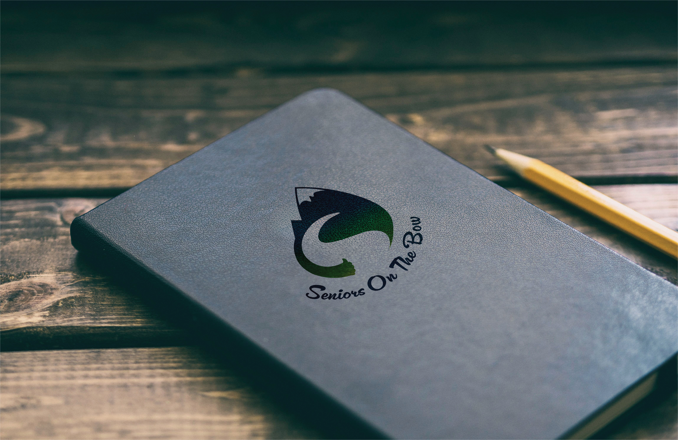
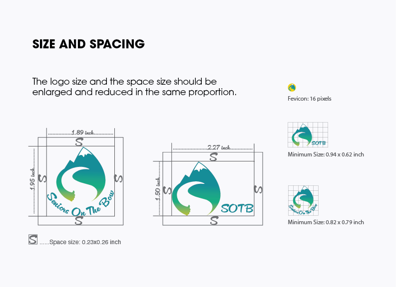
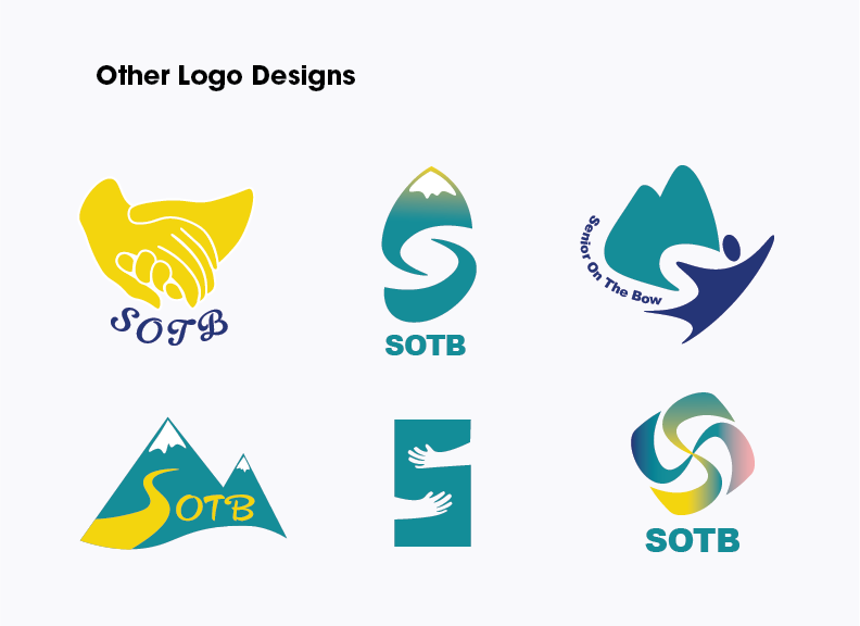
SOTB is organized in Cochrane, and the logo shows SOTB in an environment with snowy mountains and streams. The river is used to form an "S" shape, which represents "Senior". The gradient color is used in the logo, which represents the colorful life of the elderly. At the same time, there is a hidden thumbs up, indicating that SOTB is a good organization. The overall logo vision is circular, which will give people a feeling of friendliness and acceptance.
Challenge
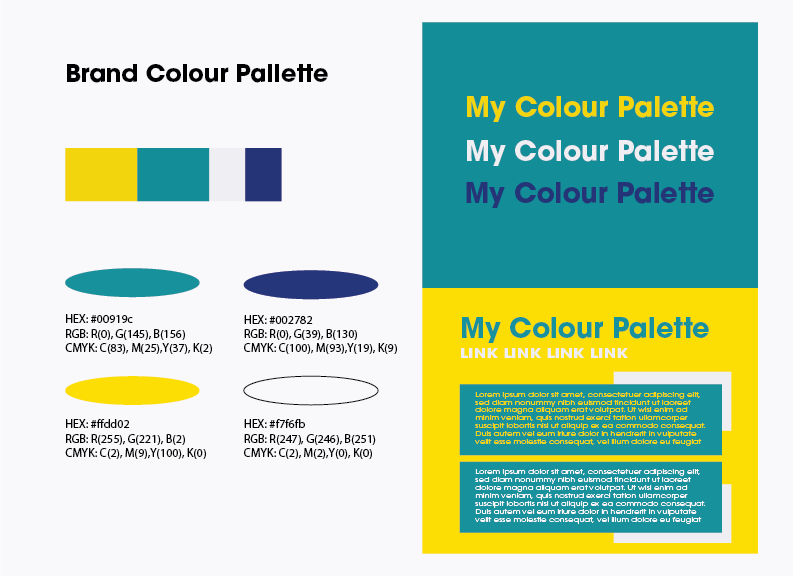
I'm always confused about color palette because it's really important in conveying visual effects. After communicating with the technical coordinator, she thought that a more colorful design would feel more vibrant. In the end we decided to use yellow, green and blue as the main colors. In addition, the initial design drafts were so diverse that it was difficult to decide which one was the best.
